
BRIEF
How can we improve a banking app's alert experience? How can we increase engagement with the alerts experience? What if we create an alerts hub? And how can we educate users about alerts, show them that they are there and explain why they might want to use them?
Project Overview
TIMELINE
6 months
TEAM
Senior UX Designer (me), Visual Designer, Senior UX Designer and UX Researcher
DELIVERABLES
Research, Ideation, Wireframes, Prototypes, and Strategy
TOOLS
Figma, FigJam, Excel, Word, Photoshop, Illustrator
PROCESS
Kickoff, research and synthesis, ideation and concept development, design of user flows, creation of wireframes, building of prototypes, concept testing, presentation to stakeholders, more research and strategic development planning.
MY ROLE
Research, Strategy, Concept Development, Information Architecture, Interaction Design, UI Design, Visual Design, Prototyping and Concept Testing Strategy. We developed three concepts and put each in concept testing. I was the principal designer and strategist for one of these concepts.


HOW IT WENT DOWN

The brief came with a bunch of research. This included an audit, user surveys, user interviews and a card sort. It also included documentation of a collaborative ideation session with stakeholders. Task number one was processing this information and doing an audit of the alerts experience.

The team, which included a lead and three designers, reviewed everything individually and then as a group. My paraphrase of everything handed off to us in the kick off: the problem to solve is increasing engagement with alerts.

Because the scope of this project was blue sky and the team lead had no interest in constraining us or confining us in any way, we decided as a team to ideate on our own for a couple days and then bring ideas back to the group. This ended up leading to three concepts which each designer worked on individually with feedback from the group as we progressed towards concept testing. I think this worked will because we came up with three good directions right art the outset and the timeline was very compressed.

Ideation
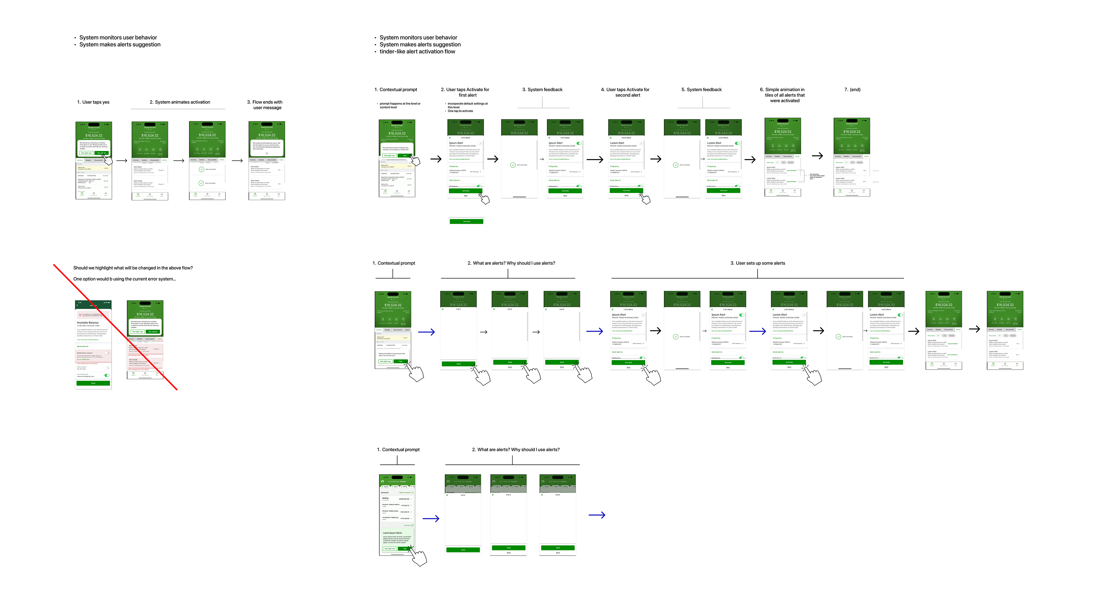
So after digesting all the kick off documents and research, after doing an audit of the alerts experience — AND after also doing a review of mobile modernization, the design systems team — a light bulb went off in my head. I had what I thought was an inspired idea. And it all revolved around an Eno-like inversion of the ask in the brief.
Everything in the kick off was focused on how to tell users about the alerts and then get them there. My idea flipped this on its head. What if — instead of taking users to the alerts — we took the alerts to the users. What if we put the alerts in context?
The BAU version of the alerts experience is a completely separate experience from the main action of the bank app, which is, obviously, the account page. The alerts experience is a direct reflection of the account page experience. Because alerts are triggered by events and actions on the account page.
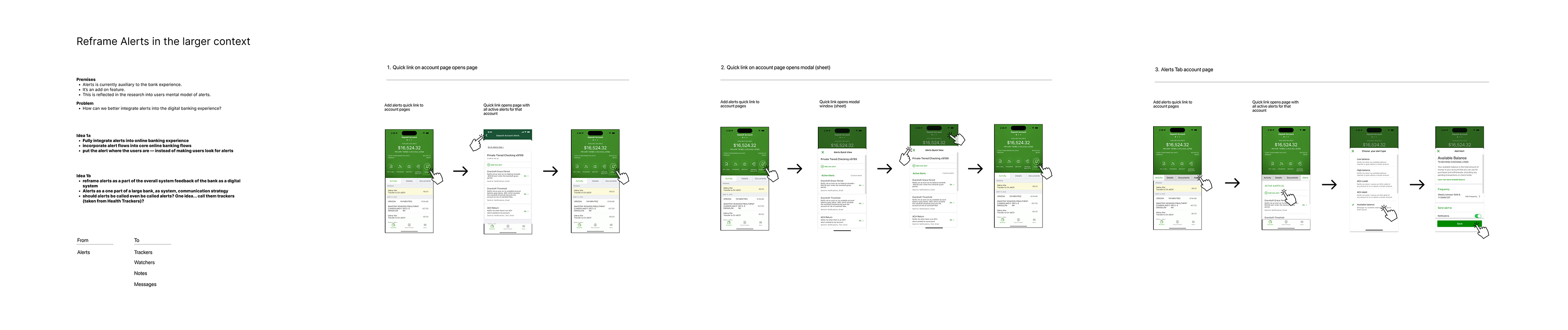

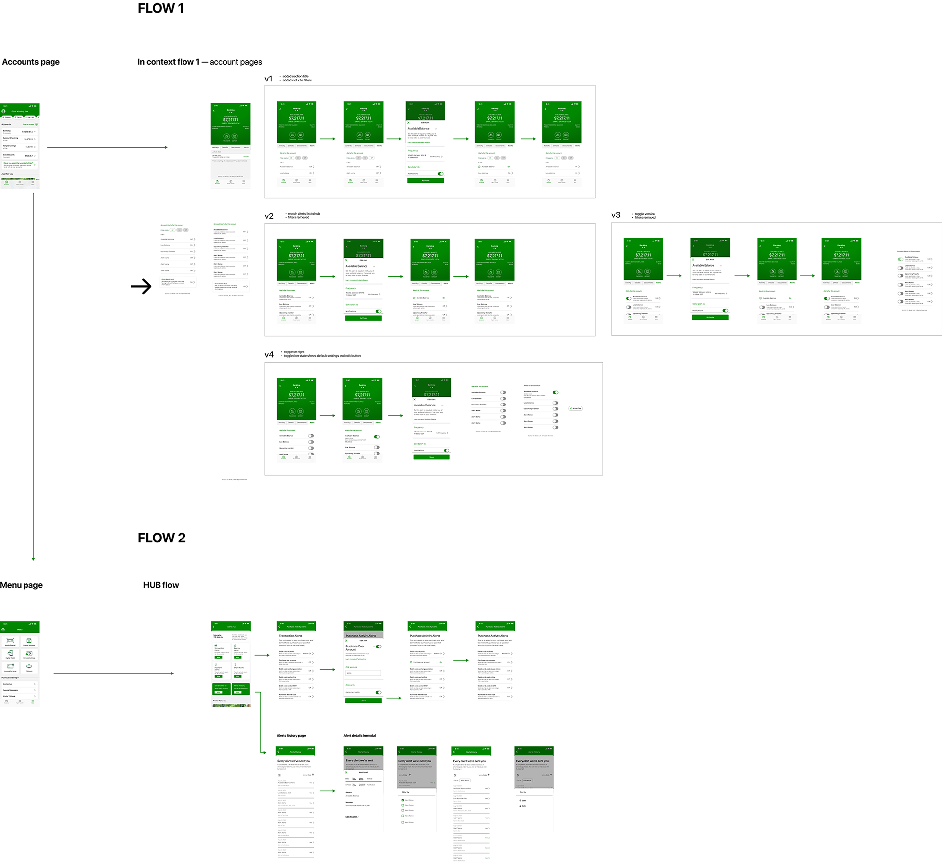
In-Context
In-Context Alerts Add/Edit Flow
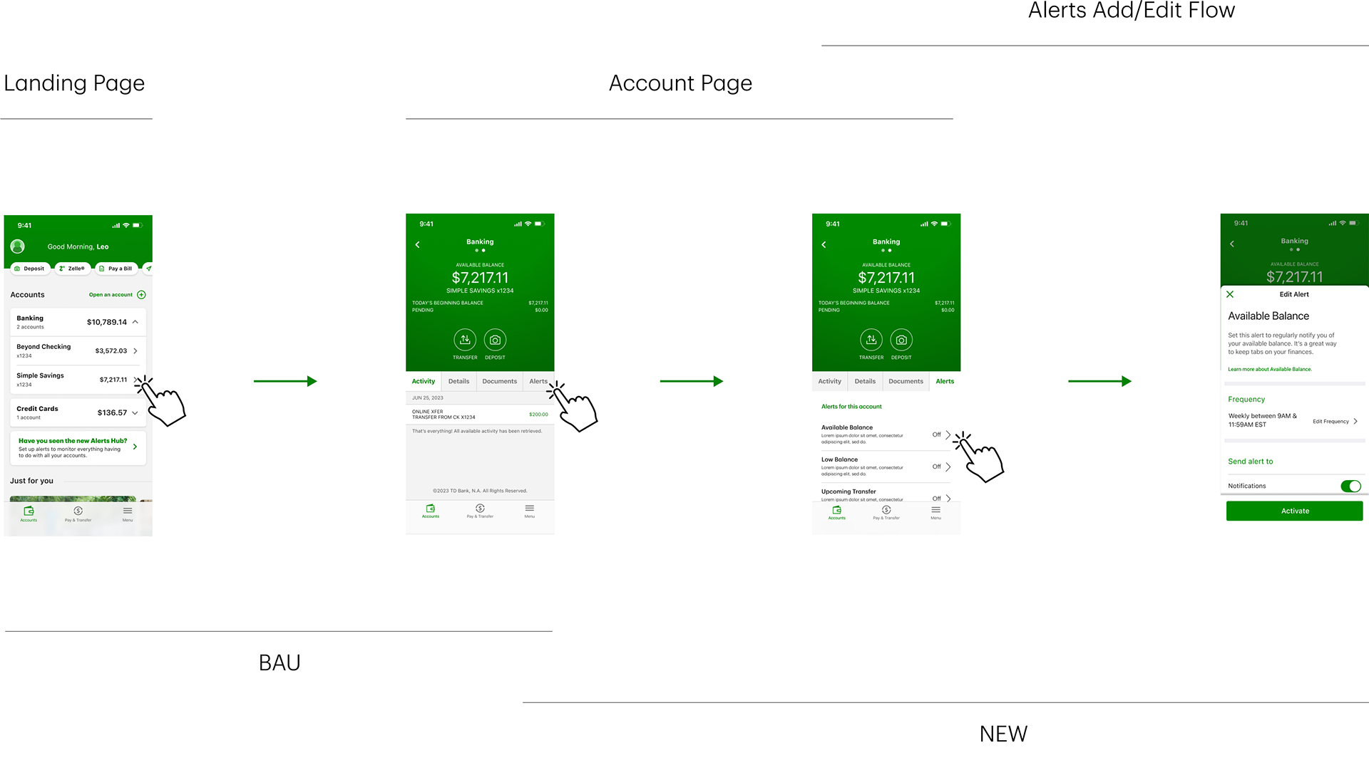
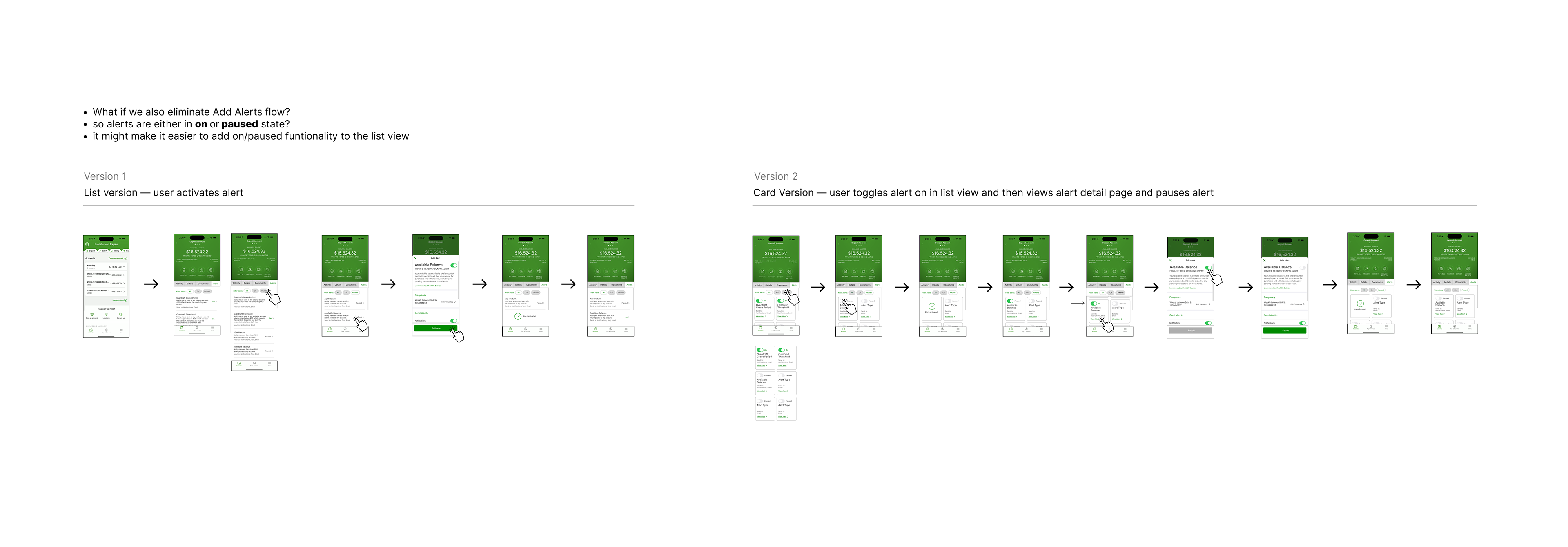
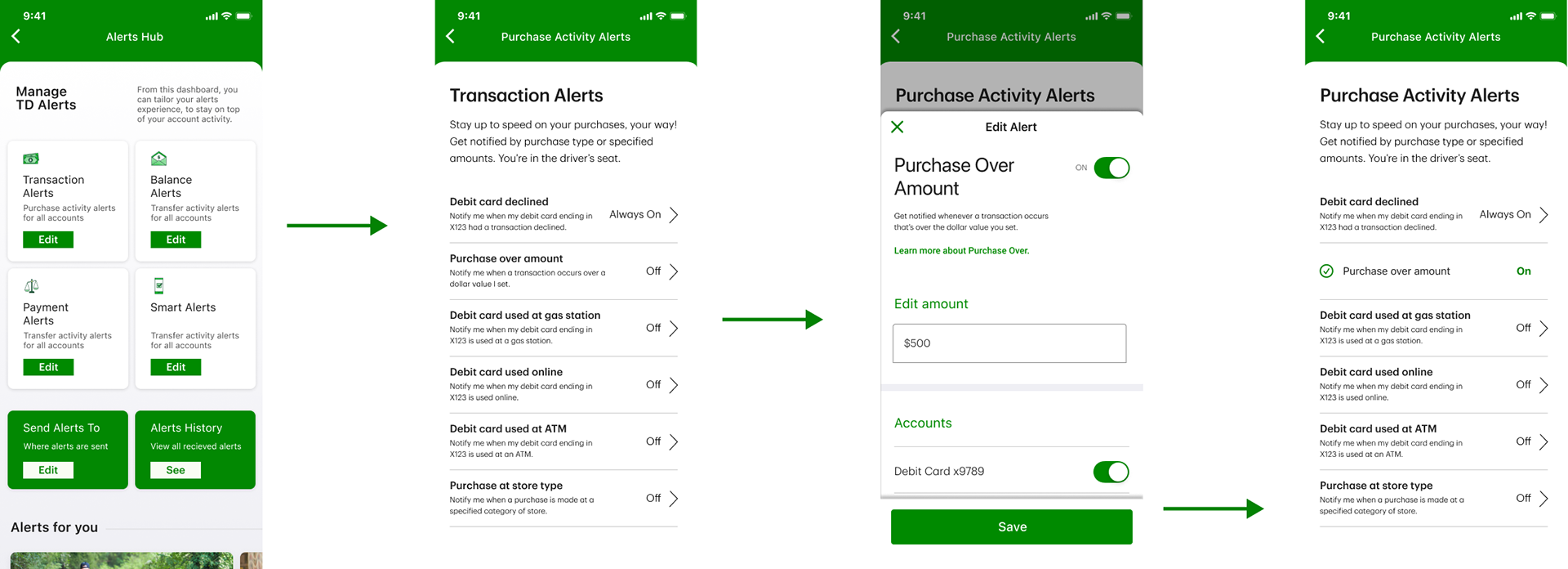
In BAU the alerts add/edit is a page. The basic flow is two pages. A list page, which lists all alerts, and an edit page, with which the user can edit an alert. In BAU, adding an alert has a puzzling complexity. So I took the BAU flow and simplified it into two pages. And combined the add and edit flows into one. To further simplify the experience I put the edit page in a modal sheet. This, in design terms, condensed it all into one page — because for the user it seems like one page.
Interestingly in "Manage Alerts", the alerts are organized per account. This information architecture naturally lent itself to in-context. The BAU flow and in-context mirror one another. In each, alerts are the children of the parent object, an account.
Once the alert ad/edit flow had been condensed into just the edit flow. And that experience was condensed into what was, conceptually, a single page, that opened over the page the user was on, it was simple to put it in-context. It was simply a matter of finding the real estate.
And there was an excellent piece of real estate on the account page. 80 x 50 pixels in a tab UI that already existed. In terms of the information architecture this placement also naturally lent itself. As I already noted, alerts are triggered by account page info, events and action. .
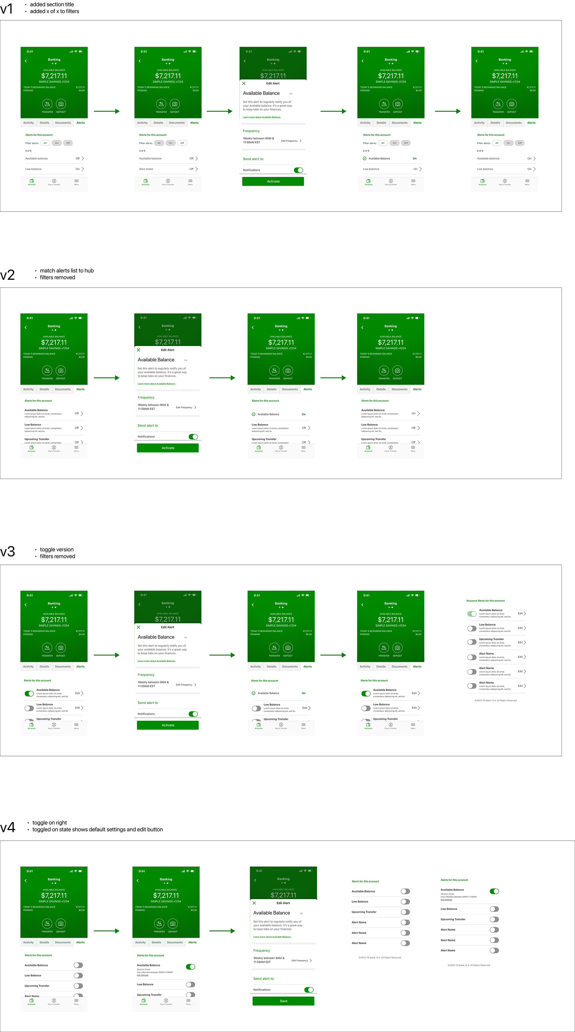
In-Context Iterations

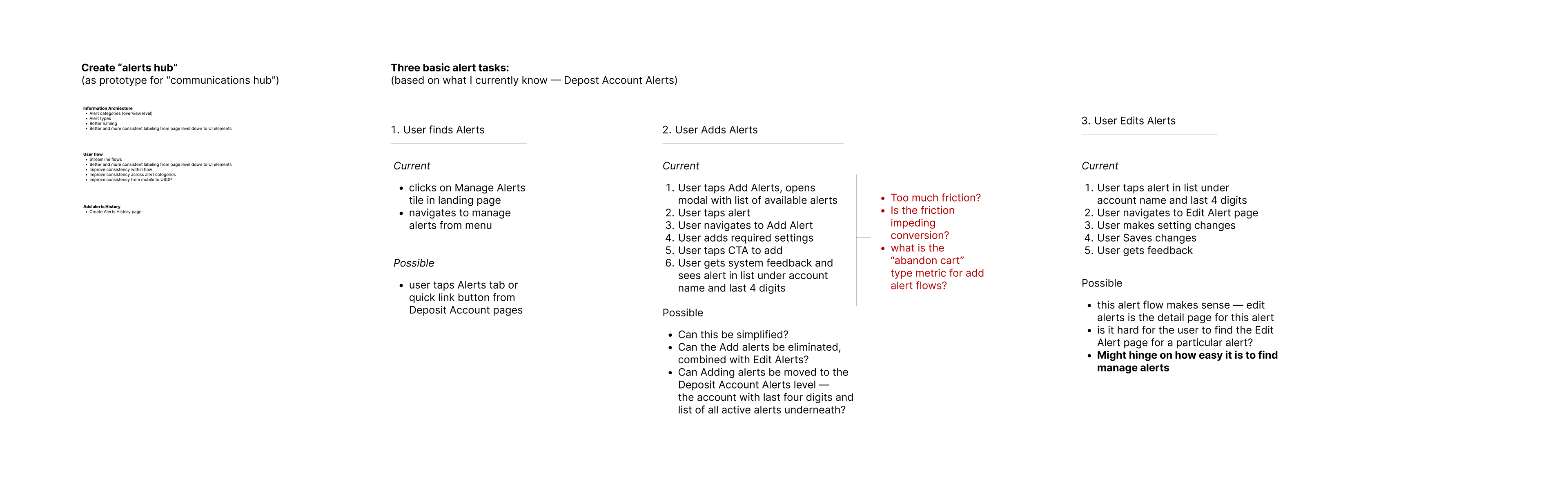
AlErts HUB
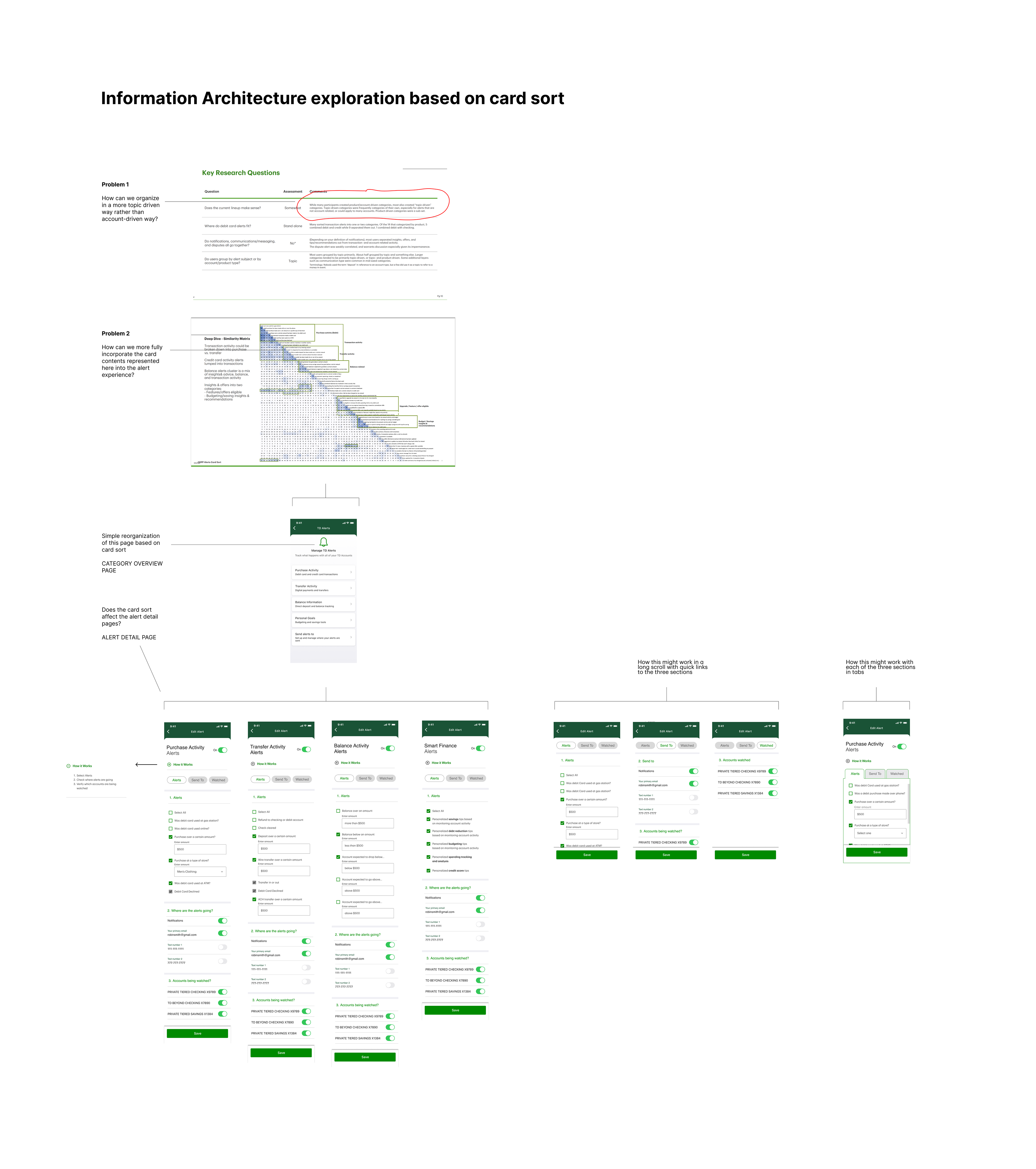
One of the ideas that came out of the collaborative design sessions with stakeholders was redesigning the "Manage Alerts" page. This is a category overview page. It is a list of links to each category.
What does not make sense for users, according to our UX research, is categories based on type of account. This was our expert intuition. And it was confirmed in the research. So we did a card sort.
I redesigned the alerts hub, first and foremost in terms of the card sort. And I also tried to make it more "hub like".
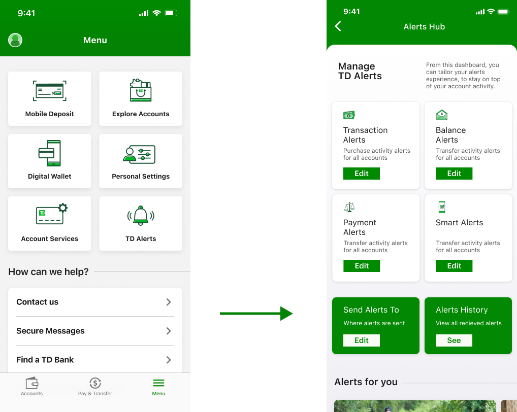
So, the flow below uses the UI design of in context but then changes it in two ways. The information architecture is reorganized by activity type, per the card sort finding, and in contrast to BAU which is organized by account type.
And, the edit alert flow is redesigned to answer a question raised by the collaborative stakeholder ideation: how can we encourage users to add alerts to multiple accounts at once?

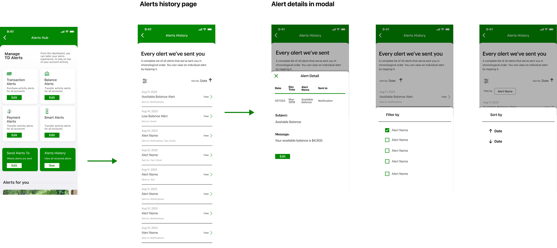
Alerts History
Collaborative stakeholder ideation raised this question: why is there no history in the alerts experience? This idea was generated to help the user AND solve a specific business problem: how can we help users better more efficiently interface with cell center and hence reduce call center time, The alerts hub redesign lent itself to this addition to the experience.

All of the above work went to concept testing, with two other concepts, and it tested very well.
It was presented at the quarterly planning meeting with positive reception.
It was decided to incrementally move forward with it.